Logo Design for a Relaxation Spa: Embracing Calm and Comfort
Crafting a Symbol of Serenity: The Smile Icon
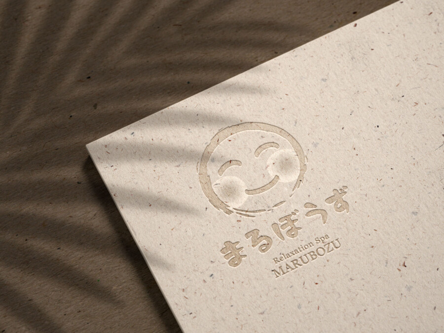
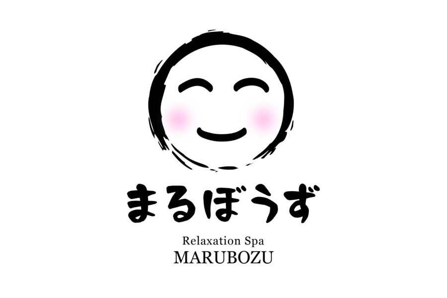
This logo design centers around a simple yet evocative icon: a smiling face. The goal was to create a symbol that instantly conveys feelings of warmth, ease, and contentment – the very essence of a relaxing spa experience. The clean lines and minimalist approach ensure the icon is easily recognizable and memorable. It avoids complex details, focusing instead on the universal language of a gentle smile, which resonates with the feelings of peace and well-being clients seek. This central element acts as a friendly and welcoming beacon, promising a comforting and rejuvenating experience within the spa. The soft curves used in the icon further enhance the sense of calm and gentleness associated with the brand.
Typography that Speaks Softly
Supporting the central icon is carefully chosen typography for both the Japanese and English brand identifiers. The fonts selected feature soft, rounded edges and a clean appearance, complementing the gentle curves of the smiling face icon. The Japanese characters are rendered with a natural, almost brush-like quality, adding a touch of organic warmth. The English text, indicating the type of service, uses a simple, legible sans-serif font that feels modern yet approachable. Together, the icon and typography create a harmonious balance, reinforcing the brand’s identity as a place of tranquility and care. The legibility and inviting nature of the text ensure clarity while contributing to the overall soothing aesthetic.
Color and Texture: Evoking Natural Warmth (Mockup Context)
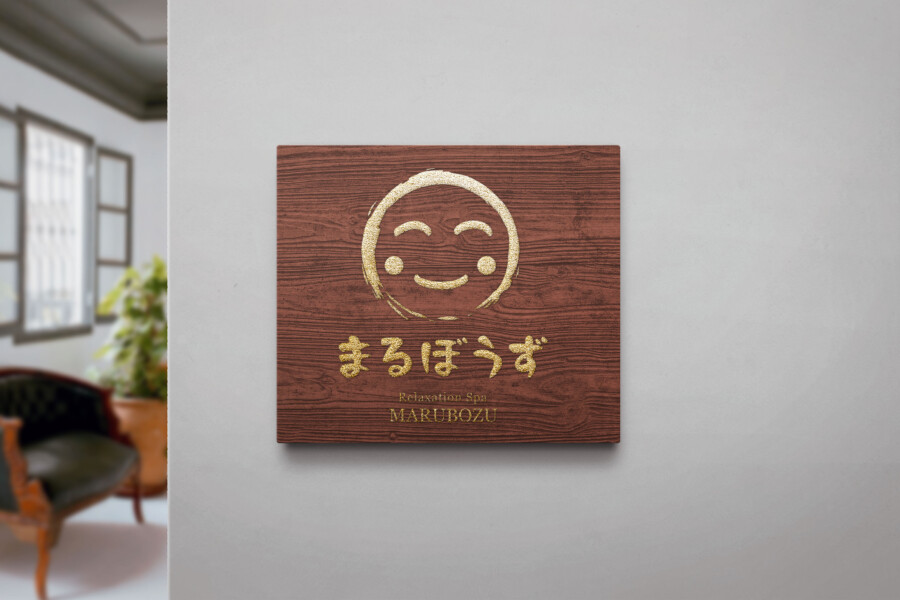
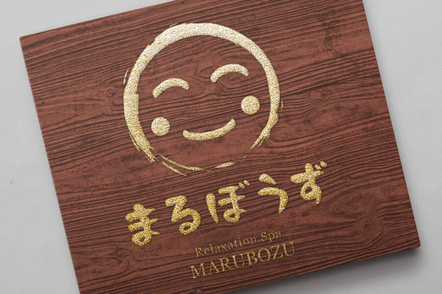
While the final logo utilizes a classic black, the mockup shown here explores its application on a textured, wood-grain background with a gold finish. This presentation demonstrates how the design interacts with natural elements and warmer tones. The contrast between the simple logo form and the organic texture highlights the design’s adaptability. Using materials like wood or warm metallic finishes in signage or interior design could further enhance the spa’s atmosphere of natural comfort and understated luxury. This visual exploration shows the logo’s potential to integrate seamlessly into environments designed for relaxation, suggesting a connection to nature and well-being.
Versatility in Application: From Signage to Digital
A key consideration in this logo’s development was its versatility across various applications. The simplicity of the icon and the clarity of the typography ensure it reproduces well at different sizes, from large-scale exterior signage to small details on amenity packaging or digital interfaces like websites and apps. The distinct silhouette of the smiling face makes it an effective branding element even when used alone. This adaptability ensures a consistent and recognizable brand presence across all touchpoints, helping to build familiarity and trust with clients seeking a peaceful retreat. The design works effectively in both monochrome and potential future color variations.
Get a Culturally Accurate Logo →
AMIX Design Studio has spent the past decade honing its craft in Japan. Through our dedicated label Japanify Works, we create designs that celebrate kanji, the Japanese language, and Japan’s rich culture—covering everything from Cultural supervision to fully bespoke branding. Quotes are always free, so drop us a line any time!
This logo design is a sample.
For logo design requests, please contact us using the contact form.
Contact Us
Also viewed: