
A shipping box that begins the brand experience
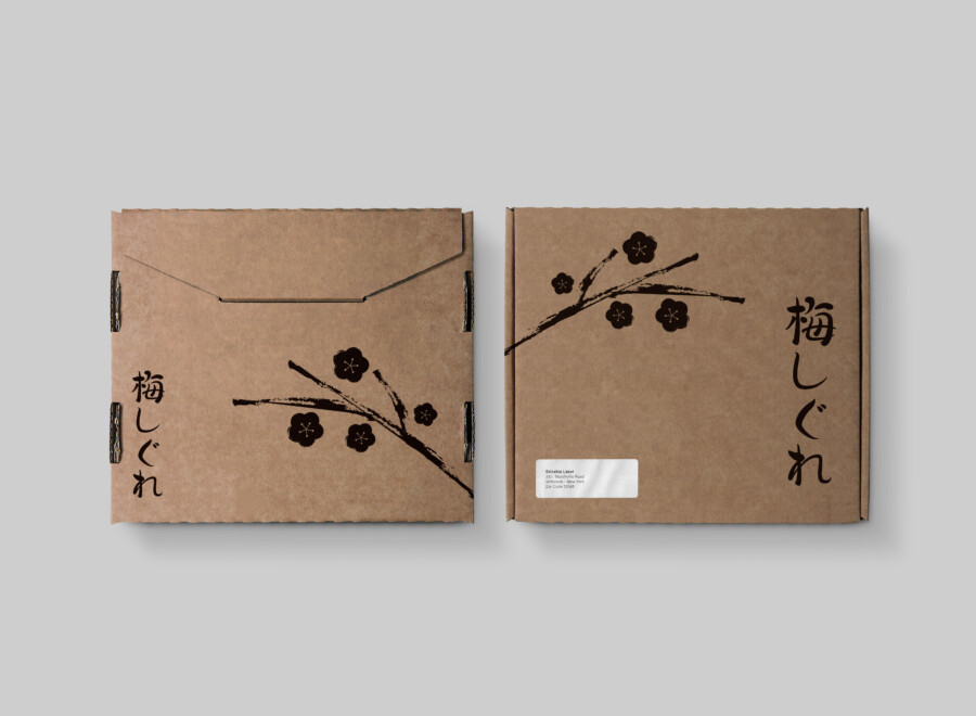
This conceptual design treats a corrugated shipping box as the customer’s first physical contact with a brand. Instead of regarding the box as neutral packing material, the composition uses its broad surfaces to create a calm, memorable arrival experience.
A single plum branch, drawn in the manner of sumi-e ink painting, crosses the natural kraft surface. The restrained treatment allows the material, illustration, and Japanese lettering to work together without making the package feel overly decorated.
An illustration designed for a three-dimensional surface
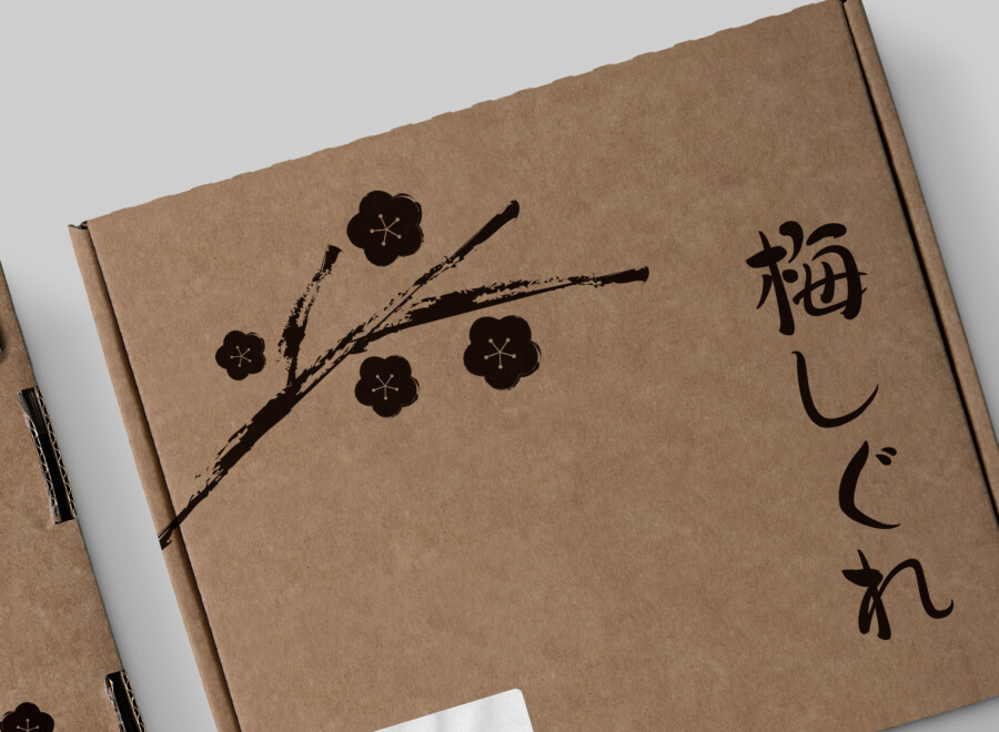
The branch continues from the lid onto the side panel. This wraparound placement takes advantage of the box as an object: the illustration changes as the recipient approaches, carries, and opens it. No single viewpoint reveals the complete composition, which gives the package a quiet sense of discovery.
Black ink brings focus to the kraft material
Printing in one dark color keeps the visual system economical and direct. The contrast defines the brushwork clearly, while the uncoated brown surface supplies warmth and texture. A full-color image would create a different impression; here, reduction is part of the concept.

Balancing calligraphy, illustration, and negative space
The design is built from only a few elements, so their scale and placement carry particular weight. The plum branch establishes movement, while the vertical product name creates a compact counterpoint in one corner.
Calligraphy adds a human rhythm
The Japanese name is set vertically in a brush-based style that relates to the ink illustration. Its purpose is both informational and visual: readers of Japanese can recognize the name, while other audiences can still perceive the contrast and rhythm of the strokes.
Negative space keeps the package composed
Large areas of kraft paper remain visible. This space prevents the branch from becoming a repeated surface pattern and gives the brand name a distinct place in the hierarchy. The result is minimal, but the material and brushwork keep it from feeling empty.
This is a conceptual package design sample. Final dimensions, materials, printing methods, and production specifications would be confirmed for an actual project.
How the design communicates across languages
Concept visualization
The package does not depend on a long written explanation. Material, image style, and layout provide visual cues that can be understood before the Japanese text is read.
Kraft paper establishes an honest, tactile tone
Unbleached board is familiar in many markets and often suggests simplicity, utility, and reduced processing. Those associations are not universal guarantees, but they help position the package as natural and straightforward.
Sumi-e provides a recognizable cultural reference
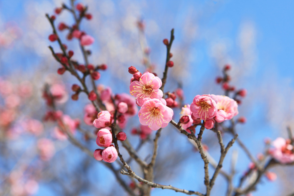
The varied brush density and asymmetrical branch create a clear connection to East Asian ink painting. Because the reference is carried by one coherent illustration rather than several unrelated motifs, the package retains a contemporary character.
Vertical Japanese lettering becomes part of the composition
For readers unfamiliar with Japanese, the lettering still contributes shape, texture, and direction. For Japanese readers, it remains a product name rather than decoration. That dual role is important: culturally specific typography should support meaning as well as atmosphere.