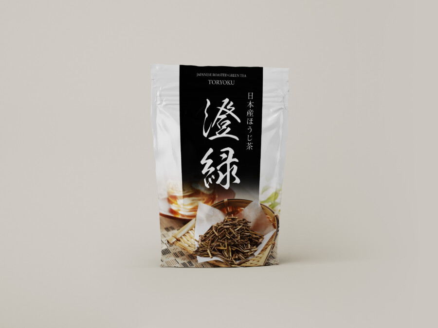
A Hojicha Package Design: Wrapping Traditional Flavor in Modern Sensibility
We undertook the package design for a Japanese hojicha (roasted green tea). Our goal was to blend the traditional image of tea with a sophisticated feel that integrates into modern lifestyles. The “white” base of the package symbolizes the product’s purity and cleanliness. Against this, we placed a bold “black” band running through the center. This strong contrast is intended to differentiate it from other products on the shelf and give it a powerful presence. We also feel this “black” visually represents the deep flavors and rich aroma that come from the hojicha’s roasting process. We pursued a design that offers a sharp, modern impression while still evoking a sense of “Wa,” or Japanese serenity.
An Eyecatching, Powerful Logotype for the Product Name
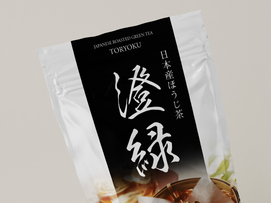
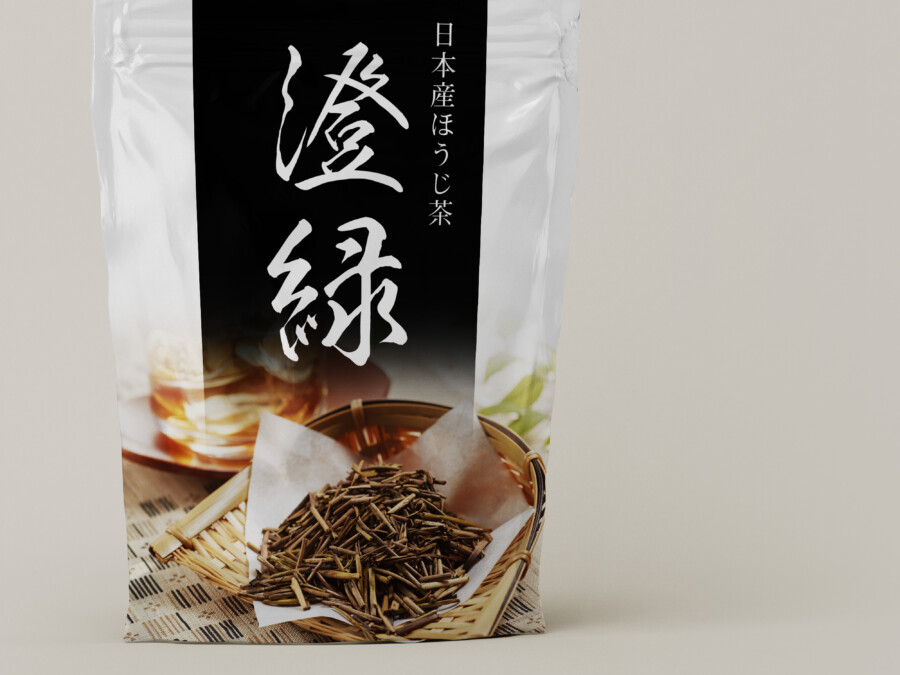
At the core of the design, and serving as its “face,” is the product name, rendered in white against the black background. We selected a typeface that, while evoking the nuances of traditional Japanese calligraphy, is also sharp and highly readable to suit modern spaces. By floating crisply on the dark background, it functions as an “eyecatch,” drawing the consumer’s gaze first. The characters used in the name seem to imply the “clear taste” and “translucent amber color” of the tea. Another character also feels symbolic of the “high-quality tea leaves” before they are roasted. We believe these characters convey confidence in the product’s quality and the story behind it.
Evocative Photography: Conveying Warmth and Aroma
Below the black band, we placed an evocative photograph that intuitively communicates the hojicha’s charm. Precisely because the overall composition is modern and simple, incorporating this concrete and warm image adds depth and a “human touch” to the design. The warm hue of the tea poured into a cup vividly suggests a relaxing, calming “tea time.” Furthermore, the photo of the tea leaves in a bamboo basket plays a role in appealing to the sense of smell through sight, conveying the unique, roasted aroma. This photography helps the consumer, at the moment they pick up the product, to concretely visualize the taste, scent, and the rich experience of drinking it.
A Sense of Quality in the Details and the “Presence” We Aimed For
A key focus for this package was the product’s “dignity” and its “poise” on the shelf. The challenge was to balance a premium feel with an approachability that invites everyday use. The discreetly placed English text at the top serves as an accent, adding a modern touch to the overall design. Conversely, the straightforward “Made in Japan Hojicha” text on the right shoulder plays the crucial role of clarifying the product’s origin, offering consumers a sense of quality assurance and trust. By intentionally limiting the amount of information and carefully arranging the elements, we designed the package to quietly highlight the product’s “essential value.”
The “White” of Negative Space and the “Tension” of Black
The “white” base of the package is not merely a background color. It functions as a vital canvas of “negative space,” expressing the product’s “purity” and “sincerity.” It is because of this clean, ample white space that the central black band and the logotype floating upon it stand out so powerfully. “Black” is a color that anchors the entire design, conveying a sense of luxury and professionalism. It could also be said to symbolize the “roasting” process—a process requiring heat and skill. We feel this clear contrast of black and white creates a refined tension and crispness, defining the package’s sophisticated impression.
A Design for Those Who Seek Both Tradition and Innovation
This design aims to set itself apart from conventional “Wafuu” (traditional Japanese style) tea packaging. While deeply respecting the culture and quality of traditional tea, we pursued a universal beauty that blends naturally into our modern lifestyles. We believe this design will resonate most with discerning individuals who appreciate authenticity and want to enjoy high-quality hojicha as part of their daily lives. Our ultimate goal was to quietly, yet clearly, communicate the passion and dedication of the producers behind the product through this package design.
This package design is a sample.
For logo design requests, please contact us using the contact form.
Behind the Design: Why This Package “Communicates” So Well

*Conceptual image
While this hojicha package looks simple at first glance, it hides a meticulous “information design” crafted to capture a consumer’s attention on the shelf.
Let’s explore two techniques this design uses to intuitively convey the product’s value.
A Smart Fusion of the “Abstract” and the “Concrete”
The most striking part of this design is the “black band” that cuts through the center. This is an abstract element. It powerfully suggests the “roasting” process, a sense of “depth,” or “professionalism.”
However, if the design only featured this black band, it might have felt a bit cold and unclear as to what the product was.
This is where the photograph at the bottom plays its crucial role. Notice how the photo is layered on top of the black band, intentionally blurring the boundary. This creates a clear visual message: “Our abstract commitment to the roasting process results in this concrete, tangible product—these very tea leaves and this beautiful amber-colored tea.”
By merging the “abstract brand concept” with the “concrete product appearance” in this way, the design allows consumers to intuitively grasp the product’s quality and story at a single glance.
The “Emotional” vs. “Rational” Use of Typography
Every piece of text on a package has a specific job. This design skillfully separates those jobs by using different typefaces and strategic placement.
- Appealing to Emotion (The Brand Name): The main product name (澄緑 – Chōryoku), set in white against the black band, is the “face” of the product. It uses a typeface with brush-stroke nuances to convey the product’s worldview and emotional appeal.
- Appealing to Reason (The Facts): In contrast, the text on the white shoulder—”日本産ほうじ茶” (Made in Japan Hojicha)—is set in a clean, highly legible serif-style font. Its job is to calmly and clearly state the objective facts: what the product is and where it comes from.
Imagine if the “Made in Japan” text were also in a bold brush font and crowded into the black band. The design would feel cluttered, and both its legibility and its trustworthiness might suffer.
By deliberately separating the “emotional” and “rational” information—giving each its own optimal typeface and location—the design allows the consumer to process both messages instantly and effortlessly: “That looks beautiful” (Emotion) and “I see, it’s domestically-produced hojicha, I can trust it” (Reason).