Crafting a Sake Bottle Design Where Tradition Meets Modernity
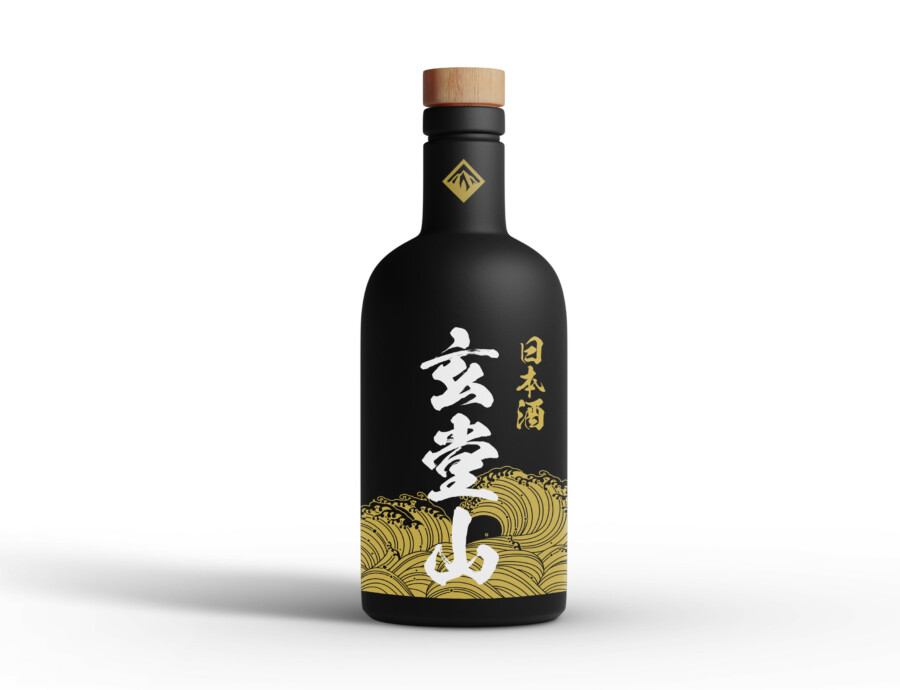
This is a package design for a Japanese sake. Grounded in a stately, matte black bottle, our goal was to express a sense of high quality and the brand’s unique worldview. The central elements are the product name, rendered in powerful, white brush-style calligraphy, and a dynamic golden wave pattern that adorns the base. By setting these active elements against a quiet black backdrop, the design visually communicates the sake’s rich flavor and deep, lingering finish. We feel it’s a design with a tangible presence, suggesting the beginning of a special moment from the instant you pick it up.
A Dynamic Composition of Calligraphy and Waves
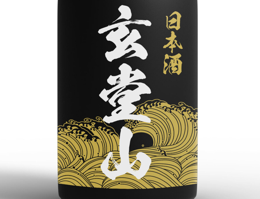
The core of the design is the brand name, placed boldly in a vertical orientation. The energetic calligraphy functions not merely as text, but as the design’s protagonist. At its base, golden waves, reminiscent of traditional Japanese patterns, spread wide, creating a composition that feels seamlessly unified with the script. It’s as if the name is dramatically emerging from the sea. This contrast between the static (the black bottle) and the dynamic (the white and gold graphics) seems to symbolize the product’s underlying strength and depth.
Color Palette and Materials that Evoke Luxury
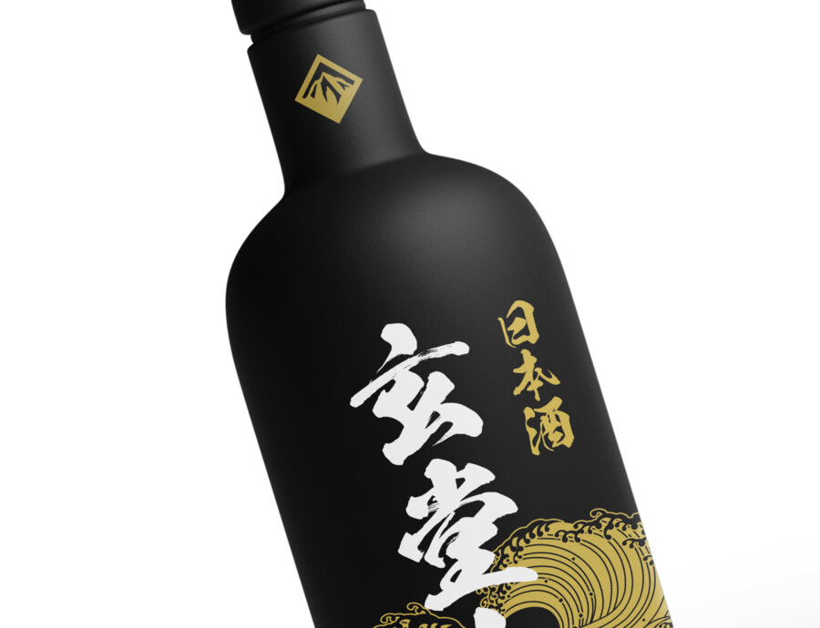
We intentionally limited the color palette to black, gold, and white to pursue a sophisticated, luxurious feel. The matte black bottle, in particular, suggests a soft, premium texture that sets it apart from typical glossy bottles, providing a sense of composed elegance. The gold pattern adds a touch of splendor while maintaining an overall sense of dignity. A small emblem on the neck acts as a subtle seal of quality. Finally, the wooden cap provides a perfect accent, lending organic warmth to what might otherwise feel too inorganic.
From Sight to Taste: A Design That Evokes a Story
A crucial role of packaging is to communicate the product’s quality and its story before it’s even tasted. This design reconstructs traditional elements (calligraphy, wave patterns) with a modern approach (a matte black finish, a simple composition). This seems to evoke an image of “a new era of sake, backed by proven technique.” When a consumer sees this bottle on the shelf, we hope they feel a sense of trust in its quality and an anticipation for its unique flavor. Designing that “pre-taste” experience was one of our key objectives.
Details That Create a Unique Identity
Beside the main brand name, the category description (“Japanese Sake”) is set in a simple, modern typeface. Placing this quiet, readable font next to the dynamic calligraphy creates a mutual enhancement, bringing a sense of balance and stability to the overall design. Furthermore, the small golden emblem on the neck, while subtle, acts as a distinct brand mark, helping to sharpen the entire impression. We believe this careful attention to detail is what ultimately forms the product’s unique identity.
A Refined Presence, Perfect for Gifting
We feel this bottle design is well-suited not only for personal enjoyment but also as a high-quality gift. The black and gold-based design carries a sense of prestige appropriate for formal occasions. We considered its presence within a gift box and the moment of surprise upon unwrapping, aiming for a design that sparks a genuine joy of ownership. It speaks to the potential of packaging to enrich the entire experience, well beyond the simple act of tasting.
This package design is a sample.
For logo design requests, please contact us using the contact form.
A Design Perspective: Why Does This Sake Feel So “Special”?
*Conceptual image
The unique presence this sake bottle commands isn’t just because it’s “black and cool.” Let’s dive deeper into the specific sensory “triggers” embedded in its design.
Designing “Water”: The Waves That Tell the Origin Story
The first thing that catches the eye is the golden wave pattern covering the bottle’s base. This is more than just a decorative Japanese-style graphic.
One of the most critical elements in determining the quality of sake is its “water.” Just as every great brewery obsesses over its shikomi-mizu (brewing water), water is truly the “lifeblood” of sake.
This design visually expresses that “water” not just as a calm liquid but as a dynamic, powerful “wave.” By doing so, it communicates the origin story of the sake—the rich, powerful water of the land from which it was born (its terroir). The composition, where the central brand name (Gendoyama) appears to be rising triumphantly from those very waves, reinforces this narrative.
From Sight to “Touch”: The Texture of Matte Black and Wood
The luxurious feel of this bottle is created not by reflective “gloss” but by light-absorbing “matte black.”
Where high-gloss black expresses “glamour,” matte black conveys “stillness” and “composure.” At the same time, this soft, non-reflective texture sparks a haptic curiosity—it makes you want to “touch” it.
Even more crucial is the “wood” of the cap. If the cap were also black plastic, it might have felt cold and inorganic. By intentionally combining the glass with a different, warmer material like wood, the design adds a “natural warmth” and a “hint of the handcrafted.”
This contrast between “cool” (the glass) and “warm” (the wood) allows you to feel the product’s depth and sophistication, even before you’ve tasted it.
The Small “Seal” That Conveys Confidence in Quality
A small, golden emblem is placed on the neck of the bottle. This isn’t just a logo; it functions much like a “kamon” (family crest) or a “rakkan” (an artist’s seal) in Japanese culture.
A rakkan is the stamp an artist presses into their work upon completion, acting as a personal guarantee: “This is a work I have finished with my full responsibility.”
By placing this small “seal” on the neck, the bottle eloquently states the brewer’s quiet confidence and their guarantee of quality: “This bottle is our pride.” When a design pays this level of attention to detail, it builds a “sense of trust” in the product for the consumer.