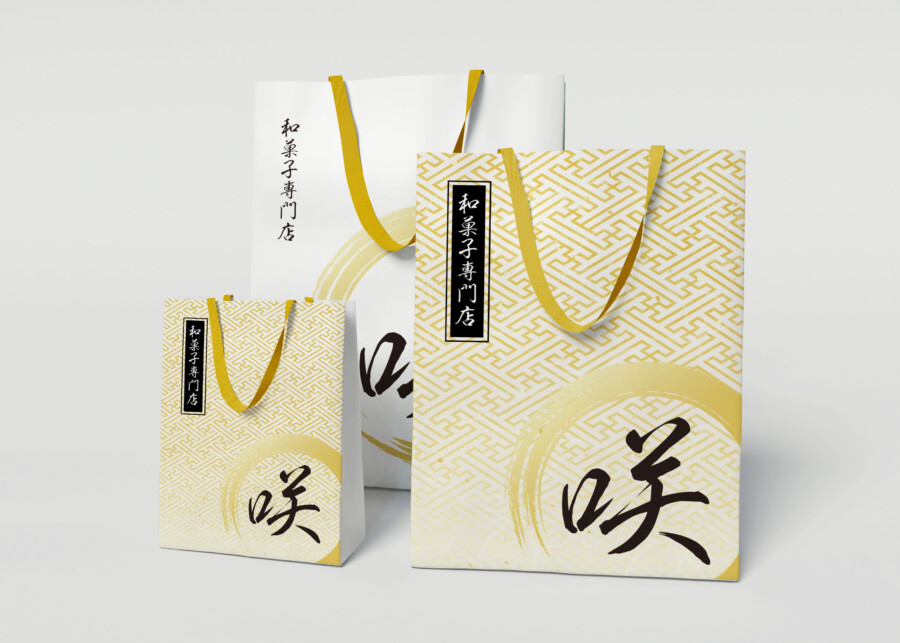
A premium shopper bag that lets customers take home a piece of Japanese beauty.
This is a design for a shopper bag, a crucial “face” for a wagashi (traditional Japanese confectionery) specialty shop. It plays the vital role of delivering the shop’s worldview, from the final moment a customer makes a purchase to the instant they present it as a gift. This design respects the formal beauty of traditional Japan while fusing it with a modern, sophisticated sensibility. A powerful calligraphic character and a circular motif are boldly placed over a background of a golden Saya-gata pattern. We aimed for a sense of “dignity” (hinkaku) that allows one to feel the rich story of wagashi every time they hold the bag.
The Character for Taste, Enshrined in a Golden Circle
At the center of the design is a single, powerful calligraphic character: “Aji,” meaning “Taste.” It symbolizes the depth and essence of the flavor that wagashi pursues. Behind it, a large, circular brushstroke, reminiscent of a golden mist or an Ensō (Zen circle), provides a “stage” for the character. This circular motif gives the entire design a dynamic motion while simultaneously imbuing it with a quiet, almost sacred, atmosphere. It feels as if it elevates the core concept of “taste” into a work of art.
The Traditional Saya-gata Pattern Woven Into the Background
The subtle, light-gold pattern covering the bag is a traditional Japanese auspicious design known as Saya-gata. This pattern, made of interlocking, stylized swastikas, carries the meaning of “unbroken prosperity and longevity.” By using this pattern as a jimon (ground pattern) that appears and disappears with the light, rather than as a loud feature, it avoids becoming overly decorative. Instead, it projects a reserved “dignity.” This delicate textural feel is what underpins the entire package’s premium quality.
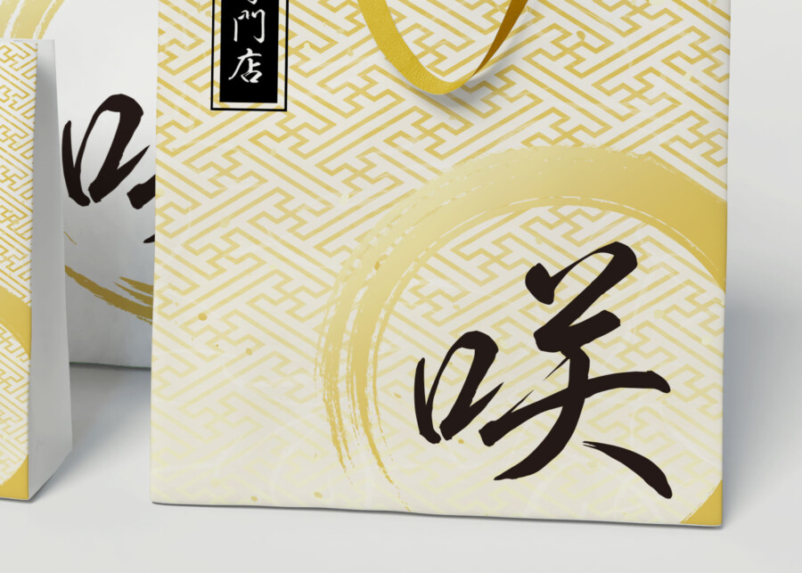
A Composition of Black, Gold, and White That Defines Elegance
This design is built on a highly sophisticated color combination: white (the paper), black (the sumi ink), and gold (the pattern and handles).
A Calculated Use of Gold
The use of “gold” is particularly decisive in defining this package’s impression. A calm, lustrous gold was selected, rather than a brilliant, glaring one. The tone of the pattern, the circular motif, and the handles are all matched. This creates a sense of unity and an iki (chic, sophisticated) sensibility, much like coordinating traditional Japanese accessories. This calculated use of color transforms a traditional product into a gift appropriate for a modern audience.
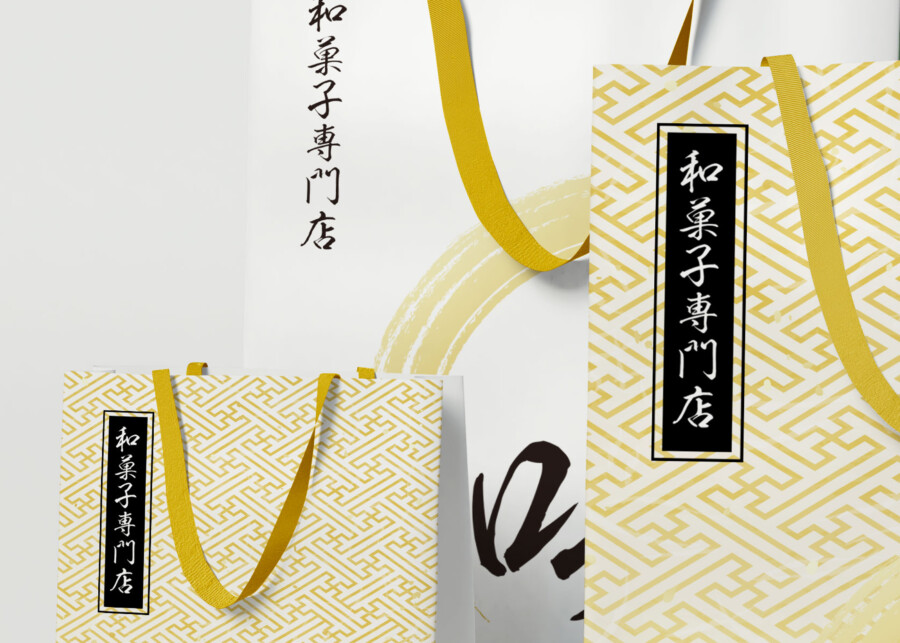
The Black Plaque That Anchors the Design
A black, rectangular plaque, reminiscent of a tanzaku (a paper strip for poetry), is used across all bag sizes. It features the vertically-set text “Wagashi Specialty Shop” in a Mincho (serif) font. This element functions like a rakkan (an artist’s seal on a painting), anchoring the entire design and giving it a formal tightness. In contrast to the emotional, flowing calligraphy, this printed text adds a “static” dignity. This small detail wordlessly conveys the brand’s “reliability” and “specialization.”
An Alternative Expression: The Power of White Space
The white shopper bag seen in the background is an alternative version that omits the Saya-gata pattern, instead leveraging the power of yohaku (negative space). This allows the central “calligraphy” and “circle” motifs to stand out even more, giving a minimal and pure impression. It expresses a different value—”simple, high quality”—as opposed to the “premium feel” of the patterned bag. This flexibility, using one strong brand motif as a foundation while adapting the design for different items, is an essential part of building a long-lasting brand.
This package design is a sample.
For logo design requests, please contact us using the contact form.
Behind the Design: The “Invisible Value” Packaging Conveys
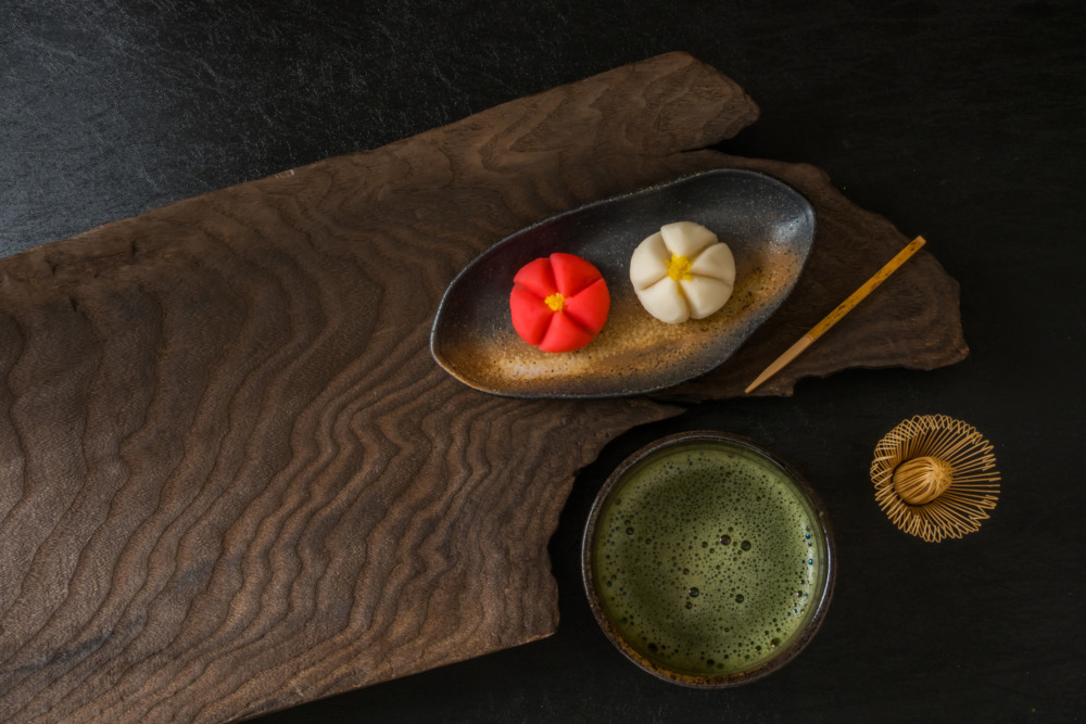
*Conceptual image
Packaging is about more than just wrapping a product. Especially for traditional items like wagashi (Japanese confections), it plays a crucial role in delivering the shop’s philosophy and its “unseen value” right into the customer’s hands.
Here, we’d like to dig a little deeper into the cultural context and thoughtful intentions behind this bag design.
The Typeface: Communicating the Warmth of Handcraft
The central character, “Aji” (味), meaning “Taste,” is not rendered in a standard, uniform logotype. Instead, it’s a dynamic “brush-style typeface.”
Why this specific choice? Wagashi are symbols of a culture that values delicate artisan skill and the pure flavor of ingredients. By intentionally choosing a typeface that retains a handwritten feel, it visually communicates the value of unique handcraft and the “warmth” of the maker—a clear distinction from a uniform, mass-produced item. The subtle feathering (kasure) and variations in line weight within the font itself speak to the depth of the word “Taste” and represent the shop’s deep commitment to quality.
Saya-gata: An Auspicious Pattern Connecting People
The golden “Saya-gata” pattern in the background is a traditional auspicious motif signifying “prosperity” and “longevity.”
Its use on a wagashi shop’s packaging is deeply meaningful. Wagashi are not just for personal enjoyment; they are “hare-no-hi” items, traditionally given for celebrations, seasonal greetings, or as formal gifts.
When a customer carries this bag to present to someone, the design itself becomes a silent message, a form of kotohogi (blessing): “I wish for your prosperity and well-being.” By using this traditional pattern, the design subtly supports the customer’s sentiment and helps to strengthen the bonds between people.
Plain vs. Patterned: Deepening the Brand Worldview
The image displays both a bag with the Saya-gata ground pattern and another that leverages plain white space. This isn’t just a simple variation; it suggests the possibility of “strategic use” to enrich the customer experience.
For instance, the more ornate, patterned bag might be used for high-end products (like those in paulownia wood boxes) or for formal gifts. In contrast, the simple white bag could be for confections bought for oneself or as a casual gift for a close friend.
Offering options that align with the TPO (Time, Place, Occasion) and the recipient is a form of omotenashi (Japanese hospitality), responding to the customer’s own thoughtfulness. By using a single, strong brand motif (the “Aji” character and circle) as an axis while varying the execution, the brand expands its range of scenarios while maintaining a cohesive worldview.