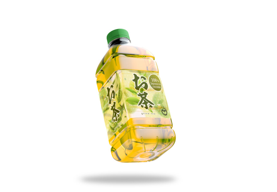
A Green Tea Beverage Package That Makes the Liquid’s “Color” the Star
In designing beverage packaging, one of the key elements we designers must address is the “liquid” itself. Especially for a product like green tea, its vibrant “color” is the most powerful “appetizing” appeal for the consumer. For this design, we started by leveraging the clear bottle, treating the liquid’s beautiful yellow-green color as the main feature. The label, in turn, acts as a “frame” to enhance this color. By placing faint green tones and tea leaf illustrations on the label’s background, we intended for the label and the liquid within the bottle to visually connect, working together to express the “worldview of green tea.”
A Powerful Calligraphic Logo That Evokes “Authenticity”
At the core of the design is the calligraphic-style product name logotype, placed in the center. To instantly convey that this is an “authentic tea” on a crowded store shelf, we deliberately chose a traditional and strong typeface. We feel that the “strokes” and “splashes” of this logotype’s brushwork evoke the life force of the tea leaves and the “aroma” rising from freshly brewed tea. By overlapping with the fresh tea leaf illustrations in the background, the logo’s strength is further emphasized, quietly asserting a commitment to quality.
Background Elements That Layer on “Freshness”
Behind the logo, vibrant tea leaf illustrations and a faint, watercolor-like green gradation spread out. This is meant to intuitively convey that the product is made from nature’s blessings. What’s notable is that these illustrations are not mere decoration; they are designed to “blend” smoothly with the color of the “liquid tea” visible through the bottle. This unity of label and contents amplifies the product’s overall “freshness.” Furthermore, by adding a mark indicating “100%” quality, we add a sense of “reliability” to the emotional “appetizing” feeling.
Designing Even the “Refreshing Feeling” of Holding It
The goal of this package design was to use visual information to evoke experiences close to touch and taste, such as “coldness” or the “sensation of quenching thirst.” For example, when lined up in a refrigerated case, the unified appearance of this vibrant green label and liquid visually communicates that the product is well-chilled. This is also about designing the “experience” at the very moment the consumer picks up the bottle. We valued the beverage-specific approach of appealing to intuition with color and appeal, rather than explaining with excessive information.
Choosing a Clear Label to Leverage the Existing Bottle
A key feature of this design is its use of a “translucent label.” This was a choice to allow the liquid’s color to show through, regardless of the existing bottle’s shape. Because the label itself is semi-transparent, the logo and illustrations gain a subtle depth against the liquid’s color, giving a more premium and refined impression. It is also intended so that when the consumer holds it, the label’s softened edge doesn’t create a harsh boundary, allowing them to feel a design that is integrated with the drink’s fresh color. This is an approach that turns the label’s translucency into a design strength.
Expressing the World of Tea with Multi-Layered “Greens”
In this label design, various tones of “green” are layered to express “green tea.” First, the faint, watercolor-like “green” in the background. Next, the vivid “green” of the tea leaf illustrations. And finally, the bright “green” that highlights the logo. These multi-layered greens resonate with the “green” of the liquid inside, expressing a deep, complex world of tea, not a monotonous one. We feel this harmony of colors is what builds the product’s “character.” By placing a quality mark near the logo, we aimed to balance this emotional beauty with a sense of “trust” and “confidence” in the product.
This package design is a sample.
For logo design requests, please contact us using the contact form.
Behind the Design: Small Details That Get This Tea “Chosen”

*Conceptual image
This green tea package hides a careful calculation designed to make a consumer instinctively reach for it in a refrigerated case. Let’s break down three of these “design details.”
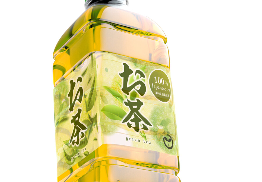
The Opaque to “Read” vs. The Translucent to “Feel”
This label design intentionally uses both “translucent” and “opaque” (white/light green) areas for different jobs.
Opaque for “Reading”: The most important element, the “お茶” (Tea) logo, is placed on a solid white and light green background. This is a functional choice. It prevents the logo from being lost against the liquid’s color, ensuring consumers can clearly “read” the brand name.
Translucent for “Feeling”: In contrast, the tea leaf illustrations surrounding the logo are printed on the translucent/clear film. This allows them to blend with the liquid’s color, creating a “feeling” of freshness and vibrancy, as if real tea leaves are floating inside the bottle.
This dual-structure—clearly showing “information to be read” while merging with the liquid to evoke “emotion to be felt”—is a key part of the design.
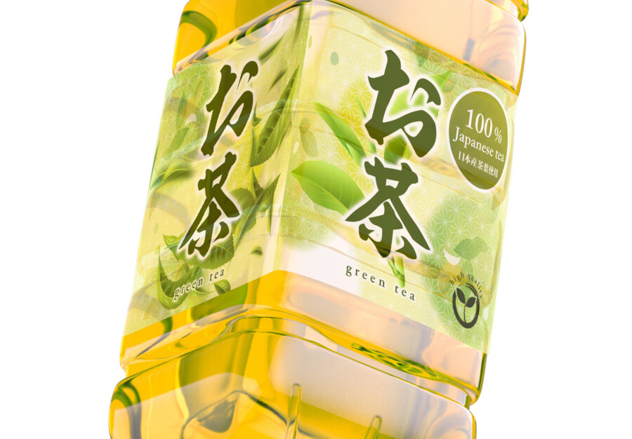
The Nuance of an “Off-Center” Layout
This label is not a perfectly centered, symmetrical design. The logo is slightly off to the right, and the tea leaves are scattered rhythmically.
If all the elements were perfectly aligned in the center, it might have given a “static” and rigid impression. By intentionally using an asymmetrical composition, the design creates a sense of “movement.”
This “movement” visually represents the “liveliness” of freshly brewed tea—like rising steam or leaves unfurling in water—and unconsciously reinforces the product’s message of “freshness.”
The Quality Mark as a “Seal of Trust”
To the upper right of the logo, a quality mark stating “100% Japanese Tea Leaves” is placed. The key detail is that this is designed not just as text, but as a circular “stamp.”
While the powerful calligraphy logo conveys an emotional appeal of “authenticity,” this stamp conveys an objective fact and the “basis for trust.” This “stamp” shape acts like a “seal of approval” for quality, giving consumers a final, rational boost of “confidence” at the moment of purchase.