A Wireless Earphone Package Where Urban Noise and “Wa” Serenity Intersect
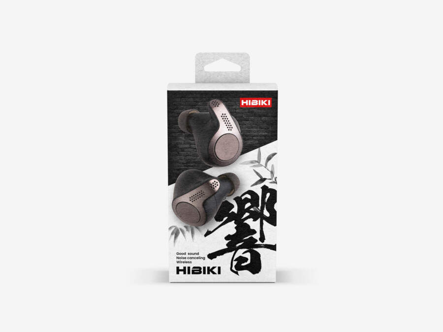
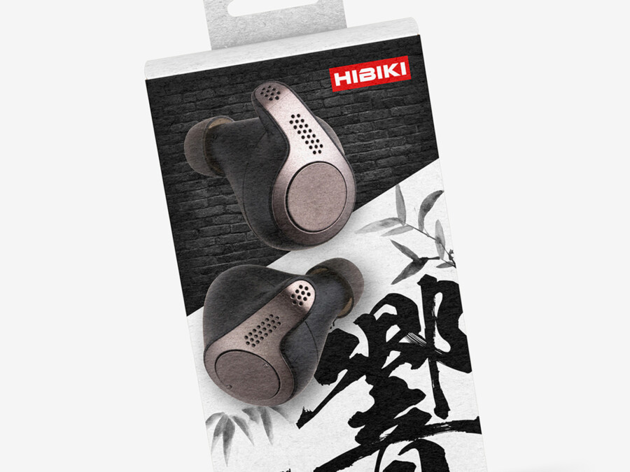
We handled the package design for a pair of wireless earphones. The theme was to balance the “precision equipment” aspect of an audio device with the “worldview” of the brand. The package background features a black brick texture on the upper portion, giving an urban impression, and a white space below that utilizes “Ma” (negative space). Upon this contrasting space, we layered a realistic visual of the product and a powerful calligraphic character that symbolizes the brand. We aimed for a design with a sense of tension, where technology and traditional Japanese aesthetics merge.
A Powerful Calligraphic Symbol at the Core of the Design
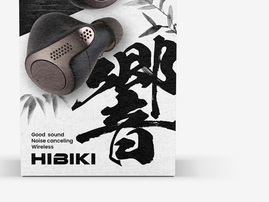
The most striking element in the center of the package is the calligraphic symbol, which is also the product’s name. This single character, meaning “resonance” or “echo,” intuitively tells the story of the “deep, rich acoustic experience” the product delivers, don’t you think? The brushwork, both wild and refined, seems to capture the very moment sound is released into space. Furthermore, the faintly drawn “bamboo” illustrations in the background add a “Wa” (Japanese) quietness and flexibility to the strength, which we feel gives the design great depth.
Placement of the Product Visual to Vividly Convey Texture
The earbuds, the stars of the show, are placed as realistic visuals to convey their unique shape and metallic texture. By intentionally overlapping them with the brick texture, they appear less like a sterile industrial product and more like a “work of art” with their own presence. By clearly showing the details of the metallic grill and the smooth curves of the parts that touch the skin, we believe consumers can build anticipation for the fit and quality even before opening the box.
A Unique Brand Identity Forged from a “Fusion” of Disparate Elements
This design builds a unique brand identity by boldly combining several seemingly disparate elements. You could call it a fusion of “Wa” (Japanese) and “West,” or a fusion of “tradition” and “innovation.” It is for the modern user who seeks both intense passion and quiet focus. We paid close attention to the textures and color scheme to resonate with such users. We aimed for a package that heights anticipation for the “sound experience” to come, from the very moment you pick it up.
The Surprising Coexistence of “Wa” and “Street” Aesthetics
What defines this design’s uniqueness is the “black brick” texture at the top. This is an element not often seen in typical “Wa” design, and it gives a “hard,” “solid” impression, reminiscent of urban street culture or perhaps a studio’s soundproof wall. By having this “dynamic” brick texture and the “static” elements of calligraphy and bamboo coexist, a unique worldview specific to this brand is established, one that doesn’t just settle for being “Japanese-style.”
A Black, White, and Red Palette to Anchor the Worldview
For the color scheme, we adopted a minimal yet extremely strong combination of “black,” “white,” and the “red” of the brand logo. Black may symbolize “heavy bass” or “depth,” while white could represent “clear high notes” or “noiseless silence.” Amidst this, the small “red” of the logo functions much like a rakkan (an artist’s seal), giving the entire design a sense of “authenticity,” dignity, and tension. We feel this calculated use of color enhances the product’s premium feel.
Typography That Balances Function and Emotion
In contrast to the emotive calligraphic symbol, the brand logo at the bottom and the functional text, such as “Noise canceling,” use a modern, highly readable sans-serif font. This ensures the design doesn’t lean too heavily on “emotion” and properly secures the “functionality” and “reliability” expected of an audio device. By accurately placing necessary information without breaking the worldview, we enhanced the design’s overall completeness. This contrast in typefaces—calligraphy and sans-serif—also seems to express the multifaceted nature of the brand.
This package design is a sample.
For logo design requests, please contact us using the contact form.
Behind the Design: How This Package “Visualizes Sound”

*Conceptual image
This earphone package might seem like a simple “fusion of Japanese and Western” themes, but it’s actually doing something deeper: it’s attempting to visually express the product’s core “function.”
Let’s break down how this design “talks” about sound from three perspectives.
The Boundary of “Noise” and “Silence”
The design is dramatically split into two worlds.
- The Top (Black Brick): This represents the “urban bustle” or “street” noise. In acoustic terms, we can see this as a visualization of the very “external noise” you want to block.
- The Bottom (White Space & Bamboo): In contrast, this represents “quiet” or “Wa serenity.” It’s the “clear sound world” or the “space where only the music you want to hear exists.”
Crucially, the earphone product itself is placed directly on the “boundary line” between this noise and silence. This is a visual metaphor for the product’s core function: it is the “door” that separates you from the noise (brick) and leads you into a world of clear sound (white space). It’s a design that visualizes the effect of noise-canceling.
The Meaning of “Hibiki” (Resonance) vs. “Oto” (Sound)
The character chosen for the center is not “音” (Oto), which simply means “Sound.” It is “響” (Hibiki).
“Hibiki” means “Resonance” or “Echo.” This word carries a much richer nuance—it implies an acoustic experience that vibrates through a space, reaches the heart, and leaves a lingering impression.
The powerful, sometimes-fading calligraphy seems to depict the very “wave” of this resonance as it expands and decays. This isn’t just a Japanese-style decoration; it’s a brand declaration: “This earphone provides an experience that resonates, not just simple sound.”
The “Seal of Quality” in a Monochrome World
The entire design is built in monochrome: the black brick, the white space, and the black ink of the character. Amidst this, only the small “red” of the “HIBIKI” brand logo functions as a vivid accent color.
This technique is reminiscent of suibokuga (Japanese ink painting) where the artist presses a “rakkan” (a red artist’s seal) on the finished work.
That “single point of red” in a monochrome world acts as a “mark of authenticity” and a “signature of quality.” This small detail adds a sharp tension to the entire design and builds a “sense of trust” worthy of a high-end product.