A Japanese Botanical Skincare Package That Gently Complements Daily Life
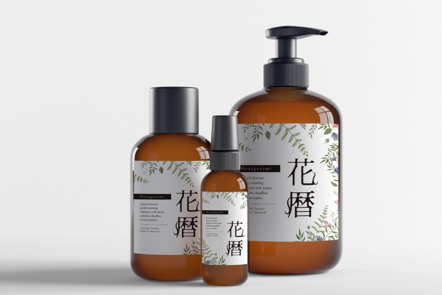
We handled the package design for a skincare line focused on natural ingredients. The lineup includes three different formats: a pump, a spray, and a standard bottle. Our goal was to create a design that allows the user to feel the product’s “gentleness on the skin” and the “blessings of plants” with every use. For the base containers, we adopted calm, amber-colored bottles, which suggest the protection of the ingredients’ quality. We combined these with “white labels” that symbolize cleanliness and sincerity. A key focus was how to harmonize “Wa” (Japanese) elements with a Western botanical atmosphere, blending them into a modern lifestyle.
Delicate Botanical Illustrations That Tell the Product’s Story
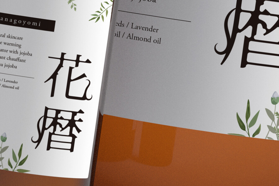
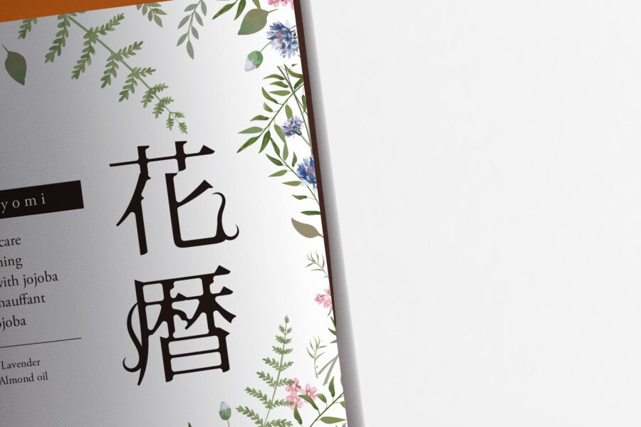
At the core of the label design are the botanical illustrations that express the product’s natural worldview. Fresh, fern-like green leaves and delicate small flowers in blue and pink are arranged to frame the top and bottom of the label. This intuitively conveys that the product uses plant-derived ingredients. The delicate, pale watercolor-like touch also seems to visually express the “gentleness” and “soothing moisture” one feels when the product touches the skin. It is natural and authentic without being overly flashy. We feel this careful balance links directly to the product’s philosophy.
A Japanese Logotype That Imparts a Refined Dignity
What brings the entire design together amidst the botanical illustrations is the Japanese product name logotype, arranged vertically. A beautiful, poetic name has been chosen, one that evokes the “changing of the seasons” or “flower tidings.” Fitting for this name, we adopted an elegant typeface based on the Mincho style. The slender vertical line creates a “spine” for the design, giving it a dignified presence. Western-style illustrations and a Japanese vertical script: these two seemingly disparate elements actually complement each other, building a uniquely elegant worldview.
Designing the “Presence” It Holds in the Washroom
Skincare items are, in most cases, placed in everyday spaces like washrooms or on vanities. We designed with an awareness of the “scenery” and “presence” the product would have as part of that space. We aimed not just to stand out, but for an existence that subtly enriches the atmosphere of the space just by being there. Because it is something seen every day, we believe a universal beauty that one never tires of, and an “approachability” that gently stays close to the user’s heart, are essential. We hope this design can become a small comfort in the midst of a busy day.
The Premium Cleanliness Created by “White” Space
In label design, “negative space” is just as important as the illustrations and text. In this design, we were conscious of utilizing ample white space rather than packing in too much information. This “white” is a canvas that symbolizes the product’s “purity” and its “honest stance” of not adding anything unnecessary. Furthermore, it is this negative space that prevents the delicate botanical illustrations and the dignified Japanese logo from feeling cramped, allowing them to breathe, stand out, and coexist gracefully. We feel this very space is the source of the product’s “premium sense of cleanliness.”
Western Text That Balances Function and Decoration
Separate from the Japanese logotype, Western text is used to convey specific product features like “natural skincare” and ingredients such as “jojoba.” This text plays a “functional” role in accurately communicating information while also serving as a “decorative” accent for the design. By combining the emotive atmosphere of the Japanese logo with modern, highly readable sans-serif Western fonts, the entire design avoids a dated impression and gains a modern sophistication. This balance of Japanese and Western text is another key element in creating the design’s pleasant feel.
This package design is a sample.
For logo design requests, please contact us using the contact form.
Behind the Design: Why This Cosmetic Blends So Well with Daily Life

*Conceptual image
The “sense of comfort” this skincare line evokes isn’t created by the natural illustrations alone. It’s built on subtle design considerations calculated to blend quietly into the scenery of our daily lives.
Amber-Colored Trust: Clothed in Apothecary History
As the existing article mentions, the “amber” color helps protect the ingredients, but this color also plays another crucial role.
Historically, this amber tint is the color of “medicine bottles” and “apothecary jars,” used for centuries around the world to preserve medical compounds. Because of this history, we, as consumers, unconsciously associate this color with “expertise,” “safety,” and “trust in the formula.”
By intentionally choosing this “medical” color, the design wordlessly communicates that the product is not only natural but also backed by science—a formula you can trust.
The Vertical Logo: Creating a Dignified Presence
Amidst the Western-style botanical illustrations that frame the top and bottom, the central Japanese logo “花暦” (Hanagoyomi) is intentionally set vertically.
In the skincare and cosmetics market, where horizontal text and English lettering are common, this “vertical” alignment creates a “subtle incongruity”—a small hook that catches the eye and makes the consumer pause.
This single “axis” that runs vertically through the design does more than just anchor the layout; it visually expresses the brand’s “dignified posture” and “sincerity.” The contrast between the soft, spreading illustrations and the firm, vertical logo spine is what gives the product its unique presence.
A “Bottle Family” That Shares One Face
The image shows three containers with different shapes and functions: a pump, a spray, and a standard bottle. If the label design had been changed haphazardly to fit each shape, the brand would have lost its unity and could have appeared low-quality.
This design consistently adheres to a basic format (the design rule) across all bottle sizes: “top and bottom illustrations” and “central logo with ample white space.”
This consistency provides a sense of recognition for the consumer when they purchase multiple items from the line (“line-up”). And when these different-shaped bottles are lined up together on a vanity or in a washroom, they create a unified “family” worldview, subtly elevating the quality of the entire space.