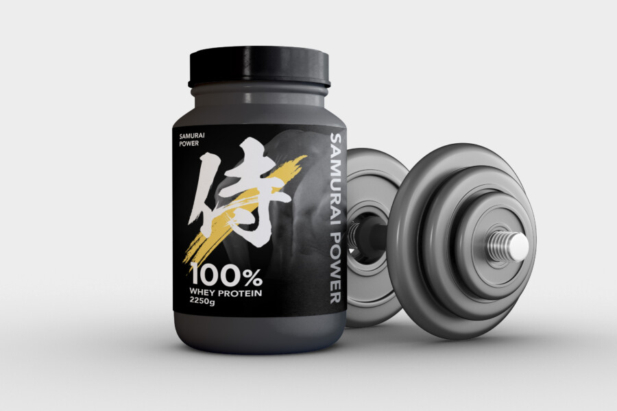
A Protein Package Embodying the Spirit of ‘Wa’ and Inner Strength
We handled the package design for a fitness supplement. In a fiercely competitive domestic and international market, a strong identity that sets it apart from other products was essential. We centered our design concept on the spirit of the Japanese “Samurai”—inner strength, discipline, and honed concentration. We adopted a matte “black” as the base color, capable of expressing both power and a premium feel simultaneously. We feel this symbolizes a stoic approach to training and the product’s unwavering quality. The goal was not flashiness, but a presence that exudes a “quiet intensity,” allowing one to feel the energy hidden within.
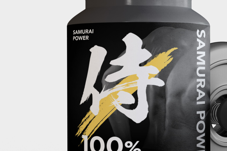
The Core of the Design: A Powerful Brushstroke Graphic
The “face” of the package is the large symbol placed in the center. It is a single character reminiscent of a “Samurai,” condensing the product’s identity. Its presence is highlighted by being rendered in vivid “white” against the black background. Furthermore, a “gold” splatter (like a brushstroke’s trace) layered over this character adds a powerful dynamism to the design. It almost feels like a flash of light at the moment of unleashing power, or the sweat bursting forth from intense training. By adding this dynamic “gold” to the “black” background, which can tend to feel static, we believe the explosion of energy is visualized.
Enhancing Readability with Modern Typography
While the main symbol carries the “passion” and “spirit,” the typography conveying product information emphasizes “functionality” and “readability.” We adopted a modern, strong sans-serif font for the Western text of the brand name. By intentionally arranging this vertically, we offer a modern interpretation of traditional Japanese formatting, reinforcing the design’s overall worldview. We also showed consideration for the consumer by placing core product information, such as “100% Whey Protein,” directly beneath the symbol, allowing them to understand what they are picking up at a glance. We feel the contrast between the emotive calligraphic symbol and the functional Western typography adds to the design’s depth.
A Design as a ‘Tool’ to Evoke a Commitment to Training
Our goal was not simply a container for a product, but a design that serves as a “partner” for the person heading into their workout. We intended for this package to function as a “tool” that boosts the user’s motivation just by being in their gym bag or at home. The ruggedness of the black container and the “discipline” and “self-control” image associated with the “Samurai” symbol will likely resonate with those facing rigorous daily training. It has a presence that seems to question one’s “resolve” and push them forward every time they pick it up. We valued this aspect of it being a “tool” that, while consumable, could be used with a sense of attachment.
The Color Strategy: Meaning Imbued in ‘Black, White, and Gold’
The power of this design is supported by a color palette limited to the bare essentials. First is the “black” that defines the overall tone. It symbolizes limitless potential and a sincere attitude toward training. Next is the “white” used for the symbol and information. This feels as though it represents the product’s “100%” purity and the “clarity” of an unwavering goal. Finally, there is the “gold” accent, used most strategically. This color is not mere decoration; it symbolizes the “release” of hidden energy and the “victory” or “glory” achieved through discipline. The contrast of these three colors strongly and deeply impresses the product’s worldview.
A Rugged ‘Aura’ That Sets It Apart
While many supplement packages use scientific appeals or flashy colors, this design intentionally chose a different approach: appealing to “instinct” rather than logic. The texture of the rugged container, the wild momentum of the brushstroke, and the worldview consolidated into the single “Samurai” symbol—these elements unite to give the product a unique presence, which might be called a “rugged aura.” When lined up next to many other products in a store or online, this package doesn’t “explain” itself; rather, we believe its very “presence” does the “talking.” We aimed for a design that speaks directly to the instincts of those who wish to become stronger.
This package design is a sample.
For logo design requests, please contact us using the contact form.
Behind the Design: Why the “Samurai” Resonates with Trainees
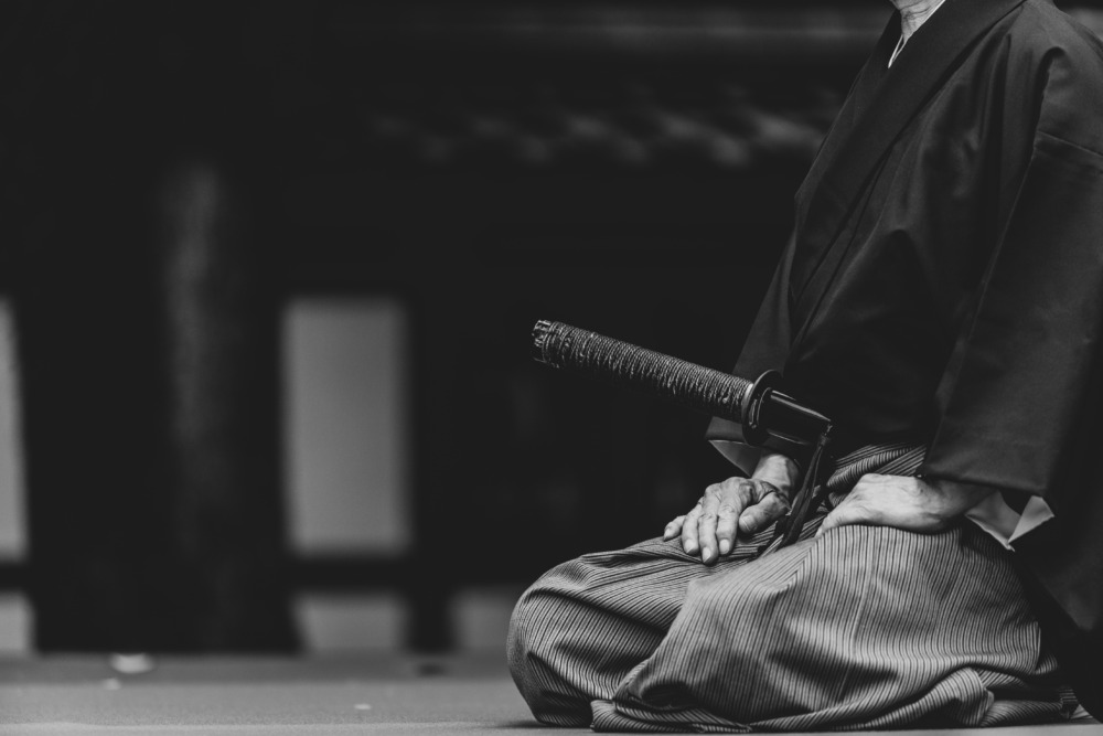
*Conceptual image
This protein package stands out in a crowded supplement market, and not just because it looks “Japanese.” Let’s break down the “philosophy of strength” embedded in its design.
The “Samurai” as a Symbol of Strength
Why “Samurai” for a protein supplement? Because people who train are looking for more than just “muscle fuel.”
Training is about daily “Discipline” and an internal battle of “Self-Control” (Kokkifuku). The “Samurai” symbol doesn’t just represent the result of strength; it represents the mentality embedded in the “process” of training itself.
This design isn’t just saying, “This protein will make you strong.” It’s sending a deeper message of empathy to the consumer: “We understand and support your stoic effort and mental fortitude.”
“Static (Matte Black)” vs. “Dynamic (Gold Splash)”
The power of this package is born from a sharp contrast in its elements.
Static: The Matte Black Container The non-reflective, matte black finish avoids flashiness and expresses a “stoic attitude.” It symbolizes the rigorous, daily, “static” effort of training.
Dynamic: The Gold Splash In contrast, the golden splash layered over the symbol represents an “explosion of energy” that shatters the stillness. It visualizes the “Breakthrough”—the dynamic moment of pushing past one’s limits or the release of internal power.
This contrast, showing how quiet “static” effort transforms into “dynamic” power, creates the drama in this design.
The Vertical “Axis” That Creates Stability
What pulls the entire design together is the vertical orientation of the Roman alphabet text, “SAMURAI POWER,” on the side.
While most supplement packages use horizontal text, this vertical alignment echoes the central “Samurai” symbol and establishes a clear brand axis: “unwavering, centered strength.”
This vertical typography doesn’t just provide a traditional Japanese feel. By combining it with a modern font, it powerfully reinforces the unique, disciplined worldview that this product represents.