![]()
A logo that captures corporate passion and perpetual flow in a single brushstroke.
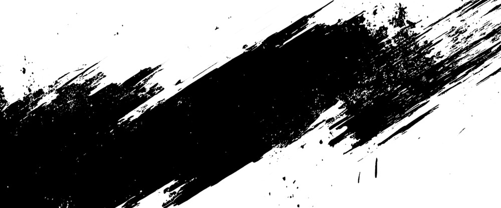
This is a corporate logo design for a logistics company. At its center are two kanji characters that seem to embody the company’s philosophy, encircled by an incredibly dynamic brushstroke. This design uses the power of traditional calligraphy (sho) to express the “ceaseless flow” and “sense of speed” of logistics, as well as the “passion” and “momentum” of a business forging new paths. The strokes, created uniquely for this logo, make a powerful statement about the company’s singular identity in a way no existing font ever could.
A Symbol of Circulation and a Connecting Path
The circular stroke that frames the logo is more than mere decoration. Like an ensō (a hand-drawn circle in Zen), it appears to signify a “perfect circulation,” with no beginning and no end. This may symbolize the essence of logistics: how goods “flow” from origin to destination and on to new places, creating a “circulation” that fuels the economy and society. This circular orbit also evokes the “path” itself, connecting the world and suggesting the company’s potential for global reach.
Two Characters Embodying Vision and Execution
The two kanji at the center—which appear to represent “Dream” and “Path”—are the “soul” of this logo. The upper character seems to stand for the company’s “ideals” or “vision,” while the lower character represents the “path” or “execution” taken to make that vision a reality. The two are unified into a single mass of energy. The calculated artistry is especially felt in how the seemingly accidental elements of calligraphy—the kasure (fading) and tobichiri (ink splashes)—are preserved. This raw, almost fierce power communicates the tangible warmth of the company’s passion.
![]()
![]()
How Material and Color Deepen Brand Reliability
While this logo has a powerful presence on its own, its “class” or “dignity” can be further elevated, showing different facets when applied to various materials and colors.
The Foundational Strength of a Monochrome Design
The basic black-on-white version best demonstrates the logo’s strong “structural integrity.” This clean simplicity is what gives it such high functionality. This “adaptability” is crucial for a company with a wide range of applications: on the side of trucks, on packing boxes, on shipping forms, and on the website. It possesses an unwavering design strength that ensures the brand image remains consistent, regardless of the material or size.
The Elegance of Gold: Communicating Quality and Trust
When this logo is applied in “gold foil” on premium paper, as seen in the mockup, its impression shifts dramatically. It instantly gains a “premium feel” and a “sense of gravitas.” In this context, the color gold functions as a metaphor for the responsibility a logistics firm shoulders—the “quality” and “reliability” required to “deliver precious cargo with certainty.” This color eloquently speaks to the added value of the service: transporting a customer’s important “dreams” and “thoughts.”
Designing with White Space to Emphasize Confidence
This is a design that carries immense energy within its brushstrokes. However, it is also intentionally designed with generous “negative space.” If this yohaku were filled with other elements, the logo might feel cramped and suffocating. This ample “pause” or “interval” (ma) is what allows the logo’s power to feel sophisticated and refined. It is an expression of the company’s “composure” and “stability”—a quiet confidence that guarantees “certainty” and “precision,” even in the midst of a fast-paced industry.
![]()
This logo design is a sample.
For logo design requests, please contact us using the contact form.
From Fleeting Art to Enduring Identity: The Power of Calligraphy (Sho) in Branding
*Conceptual image
The preceding analysis touched upon this logo’s themes of “circulation,” “passion,” and its potential material applications. Here, we will take a step further to examine how this design successfully elevates the unique characteristics of “Sho” (Japanese calligraphy) from a fine art into a stable corporate identity.
Reconciling a “One-Time” Art with a “Permanent” Symbol
Where traditional Western typography often pursues “static beauty” and stability through calculated ratios and uniform lines, Japanese “Sho” is a “dynamic art.” It is defined by its ability to capture the fleeting energy of a single moment—the angle of the brush’s entry, the density of the ink, the velocity of the stroke, and even the “accidental” qualities of kasure (fading) and sumi-chiri (ink splashes).
By its very nature, “Sho” is a “one-time-only art form.” A corporate logo, however, must be the opposite: it is a design built for “permanence” and constant “reproducibility.”
This logo’s core achievement is its success in reconciling these two opposing forces. It retains the raw, instantaneous energy of a freshly brushed character while simultaneously existing as a calculated, permanent, and reproducible symbol of the brand.
“Organic Forms” as an Expression of the “Human” Side of Logistics
The business of logistics is often perceived as “inorganic” and “functional,” defined by systems, trucks, warehouses, and data. This logo, however, is filled entirely with “organic” forms—living curves and unpredictable, fluctuating line weights.
This distinction appears to be a direct reflection of the company’s philosophy. It suggests that logistics is not merely the “mechanical movement of objects,” but an endeavor driven by human passion, will, and vision (the “Dream” and “Path” noted in the original analysis).
The “non-uniformity” and “rawness” of the brushstrokes are not noise; they function as “evidence of passion.” For a Western or English-speaking audience, this visible “trace of the hand” evokes a sense of trust and “warmth” that standardized fonts cannot. In a digital age, it powerfully communicates the “human core” at the heart of the company’s activities.