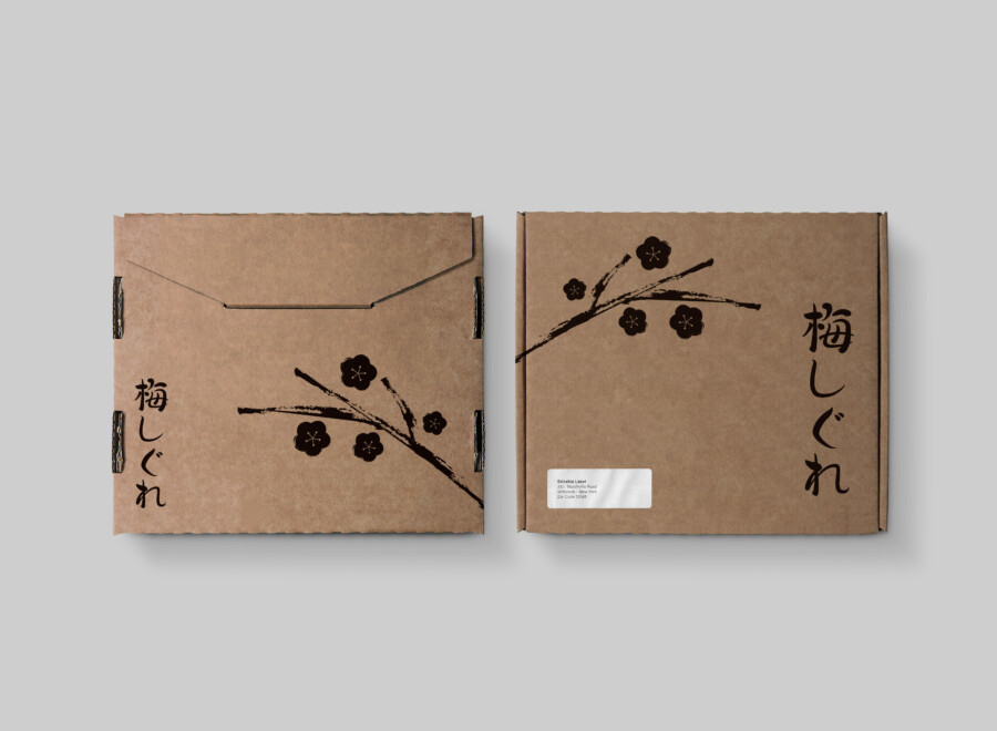
A shipping package that begins the brand story before the box is even opened.
This is a package design for a corrugated cardboard shipping box, designed to be the very “first moment” a product reaches the customer. While often treated as mere packing material, we re-envisioned this box as a core part of the “brand experience.” Using the simple, rustic texture of the craft paper as a canvas, we placed a bold “plum branch” illustration, reminiscent of traditional sumi-e (ink wash painting). The design was carefully considered to ensure the recipient feels they are receiving a “gift” that sparks joy, rather than just a “package.”
A Bold Composition That Crosses Boundaries
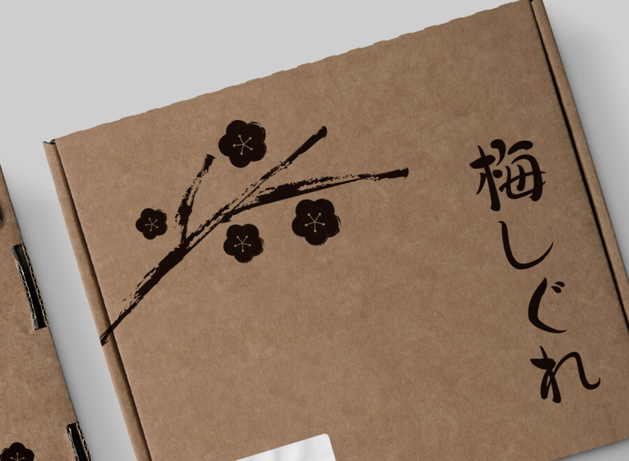
Perhaps the most distinctive feature of this design is how the single plum branch is laid out to “cross” from the “top” of the box onto the “side.” This is an expression only possible on a three-dimensional object, unlike printing on a flat sheet of paper. This layout ensures that a different aspect of the illustration is visible from every angle. When it arrives, when it’s placed in the entryway, and when it’s finally picked up to be opened—in each scenario, this plum branch acts as a “guide,” building anticipation for the product inside.
The Elegance of a Single Ink Color
The box itself is an unbleached craft cardboard. Against this earthy, natural material, the design is composed using only “black” (sumi) ink. While a colorful print was an option, we deliberately omitted color, choosing to express the “plum” using only silhouette and brushwork. This clean, “subtraction-based” design accentuates the warmth of the craft paper and the strength of the black ink, resulting in an impression that is both “chic” (iki) and sophisticated. We feel this simple composition maintains a sense of “dignity” while also being functionally considerate.

Japanese Minimalism: A Harmony of Art and Text
This package design is composed of two main elements: the “plum illustration” and the “vertical text.” Both follow the worldview of traditional Japanese shoga (calligraphy and painting), yet are designed to harmonize beautifully as a modern product.
Calligraphy that Conveys a Sense of Poetry
The brand name, placed vertically in a corner, is a vital design element that resonates with the ink-painting motif. This typeface, which shows both strength and a certain suppleness, seems to speak for the “dedication” and “careful handiwork” behind the product. By choosing “calligraphy” (sho) rather than a symbolic logotype, it more deeply conveys the “poetic sentiment” and “story” of the product’s world to the customer.
An Atmosphere Defined by Negative Space
This design does not crowd the space with information; instead, it treasures the “ground” of the craft paper itself, the “negative space” (yohaku). By boldly omitting everything except the plum branch and the brand name, the design gives the recipient ample room for imagination. This “empty space” is precisely what enhances the presence of the plum branch, bringing a quiet, clear “atmosphere” to the entire package. It is minimal, yet it conveys a rich emotional landscape—an embodiment of “Japanese minimalism.”
This package design is a sample.
For logo design requests, please contact us using the contact form.
How This Design Communicates “Japan” Without Words
*Conceptual image
The previous analysis explored this package’s minimalism and 3D composition. Let’s now examine how this design successfully communicates its brand values to an English-speaking audience who cannot read the Japanese text.
Craft Paper: A Universal Symbol of “Honesty”
First, we must note the choice of material: unbleached craft cardboard.
In a global context, this is more than just “rustic.” It has become a “universal symbol” that instantly communicates positive values like “eco-friendly,” “sustainable,” and “natural.”
For an English-speaking viewer, this raw, “as-is” texture is intuitively seen as proof of the brand’s “honesty” and “authenticity,” setting a positive tone before the box is even opened.
The Sumi-e Style: A Cultural “Signature”
Next is the design’s protagonist: the plum branch, rendered in a sumi-e (ink wash painting) style. This specific style—using brushstrokes and varying ink density—is a powerful “cultural signature.”
Many in a Western audience will immediately recognize this aesthetic as “Japanese” or “East Asian.”
This style is more evocative than a simple “Made in Japan” label. It tells a story of “tradition,” “craftsmanship,” and “delicacy.” Even if the words are unreadable, the art style itself guarantees the product’s quality and origin.
Vertical Calligraphy: A Visual “Graphic”
Finally, let’s consider the vertical Japanese text,「梅しぐれ」. For most English speakers, this is not text to be “read.”
To their eyes, this functions not as “information” but as a “graphic pattern” or accent.
The vertical orientation is novel and visually striking to a culture accustomed to horizontal text. Its calligraphic texture resonates with the plum branch illustration, elevating the artistic feel of the entire package.
In conclusion, this package design does not rely on written explanations. Instead, it masterfully uses a non-verbal “visual language”—material (craft paper), style (sumi-e), and layout (vertical text).
These elements combine to eloquently communicate the brand’s core values of “honesty,” “tradition,” and “artistry” across borders, making the recipient feel they are receiving a “special gift,” not just a “package.”