![]()
A brand logo of quiet healing to restore mind and body.
This is a brand logo for a relaxation spa that offers a special experience: a quiet escape from the noise of daily life to look inward. The design is exceptionally clean and minimal, eschewing all excessive decoration. This seems to reflect the “pure healing” the service provides, as well as an underlying philosophy, akin to Zen, of “sharpening the five senses” by removing the superfluous. The four-kanji brand name at the center firmly conveys the logo’s core of “quiet strength.” We aimed to create a “face” for the space that would evoke a sense of spiritual fulfillment and deep relaxation.
The Lotus: A Symbol of Spiritual Purity
At the top of the logo sits a symbol of a single, quietly blooming lotus flower. The lotus has long been a symbol of “purification,” “rebirth,” and “spiritual awakening,” as it rises from murky water to produce a pure flower. This mark seems to express the sensation of being purified in mind and body through the spa experience. The arching line that gently envelops the flower could also be seen as a “sanctuary” protecting the guest, or a metaphor for a “state of fulfillment.” Though simply illustrated, it is a brand icon rich with meaning.
The Quiet Strength of Kanji Typography
At the heart of the logo is the brand name, composed of four kanji that evoke concepts like “Zen,” “Rest,” and “The Five Senses.” A Mincho-style (serif) typeface was chosen, which imparts both “legibility” and “dignity.” The small decorative elements at the end of the strokes (serifs) bring a subtle tension and high-quality feel to the design. Its character is one of restrained, “quiet strength”—the very opposite of a forceful, calligraphic style. This may symbolize the spa’s unique method, which appeals not to emotion, but intellectually and deeply to the five senses. This classic, unpretentious typeface choice only enhances the brand’s “reliability” and “essence.”
![]()
![]()
A Sophisticated Layout Where East and West Harmonize
This logo design strikes an exquisite balance between the main kanji logotype and the supporting European-language text.
The Role of Western Text in a Modern Impression
Just below the lotus symbol, the business category “Relaxation spa” is placed. A slender, elegant serif font is used here, distinct from the main kanji type. The addition of this text ensures the logo does not feel merely “Japanese,” but lands as “modern” and “sophisticated” with an international sensibility. This balance in the layout of Japanese and Western text conveys the brand’s stance: one that treasures the Japanese spirit while embracing the sense of quality demanded by modern, urban clientele.
How Letter-Spacing Creates a Sense of Time
The European text “Relaxation spa” features “letter-spacing” that is wider and more generous than standard. If the letters were set tightly, it might have given a cramped or hurried impression. By intentionally giving the letters a luxurious “negative space” to breathe, it imparts an air of “calm” and “composure” to the entire logo. We feel this is a visual representation of the “unhurried flow of time” one experiences at the spa. This meticulous attention to “space” (ma) in every detail is the very source of the “comfort” it communicates.
A Design That Elevates Its Environment
A logo is arguably not complete until it is installed in its intended space. When the logo is applied three-dimensionally (as dimensional letters) to a simple gray wall, the resulting shadows make its clean lines stand out even more. It radiates a “premium feel” and “dignity” that is greater than when viewed on a flat plane. A romanized version of the name is also added below to aid readability. In this way, the design flexibly adapts to its environment, yet never loses its core “air of tranquility.” It is a design with the power to quietly blend into any space and elevate its quality.
This logo design is a sample.
For logo design requests, please contact us using the contact form.
How This Logo “Translates” an Abstract Eastern Concept
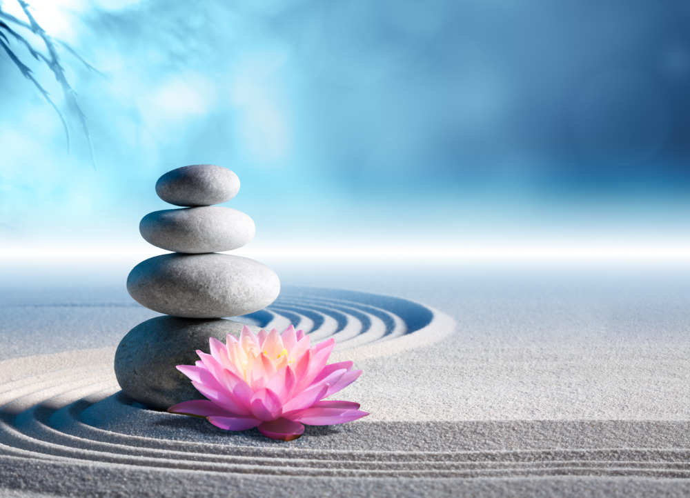
*Conceptual image
The previous analysis explored how the logo’s individual components (the lotus, typeface, and layout) create an atmosphere of “serenity” and “quality.”
Now, let’s shift our perspective to examine how this logo “translates” the brand’s core concept—「禅休五感」 (Zenkyu Gokan), a highly abstract and culturally specific idea—for an English-speaking audience.
The Global “Entrance”: The Lotus Symbol
The brand’s deepest philosophy is contained within the four kanji characters. However, for an English-speaking viewer who cannot read them, their profound meaning (“Zen,” “Rest,” “Five Senses”) is inaccessible.
Therefore, the “true entrance” to the brand is the lotus flower symbol at the top.
The lotus is a “global visual language.” Without requiring specific cultural knowledge, it intuitively evokes “purity,” “spiritual awakening,” “peace,” and “Eastern wellness” (an aesthetic shared with yoga and meditation).
A viewer first sees this symbol and unconsciously categorizes the brand as belonging to the world of “serenity” and “spiritual healing.” This serves as the first “bridge” to the abstract concept.
The Reassuring “Guide”: The Western Text
After the lotus establishes the abstract idea of spirituality, the Western text “Relaxation spa” provides the concrete “context.”
It clearly guides the viewer, clarifying: “This is not a religious institution, but a ‘spa’ service you can experience.”
Furthermore, as noted in the previous analysis, the generous letter-spacing is a universal design cue. In Western aesthetics, just as in Japanese, this “breathing room” signifies “luxury,” “quality,” and “a premium, unhurried use of time.”
This reassures the viewer, communicating that the experience is both “spiritual” and a “high-quality service.”
The “Proof of Authenticity”: The Kanji
So, what role does the main kanji text, 「禅休五感」, play for this audience?
It functions not as text to be read, but as a graphic “proof of authenticity.”
The choice of typeface is critical here. It is not an emotional, calligraphic script. Instead, it is an intelligent, poised, and serene Mincho (serif) typeface. Its balanced and disciplined structure visually matches the popular Western image of “Zen”—that of “calmness,” “order,” and “mindfulness.”
The kanji serves as a “seal of quality.” It proves that the promise made by the lotus symbol and the “spa” text is not a superficial theme, but is backed by a genuine, authentic Eastern philosophy.
In this way, the logo employs a sophisticated, multi-layered communication strategy. It attracts with a global symbol (the lotus), reassures with functional text (the spa), and validates its authenticity with its symbolic text (the kanji). This is how it successfully crosses the cultural barrier to convey its core brand value.